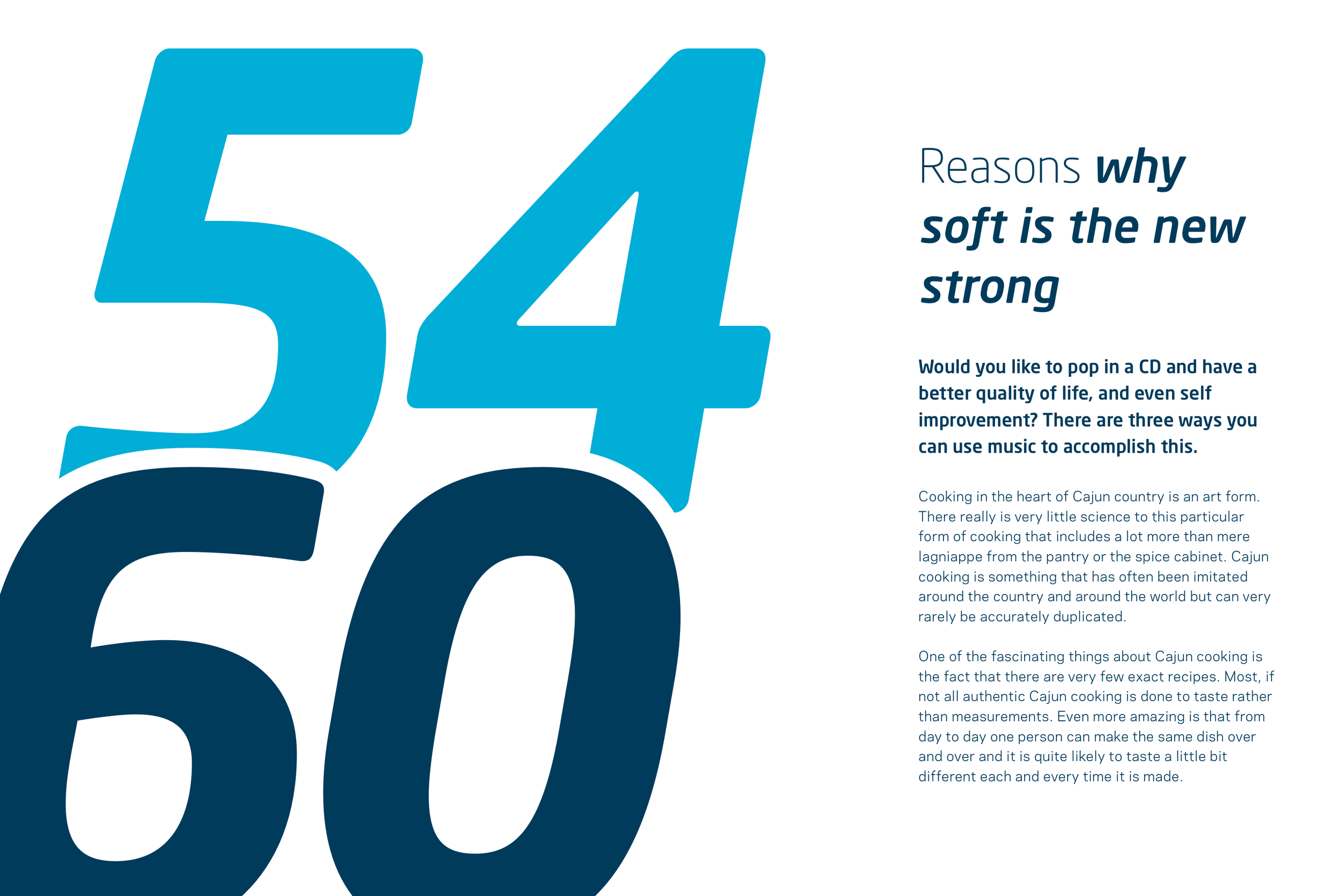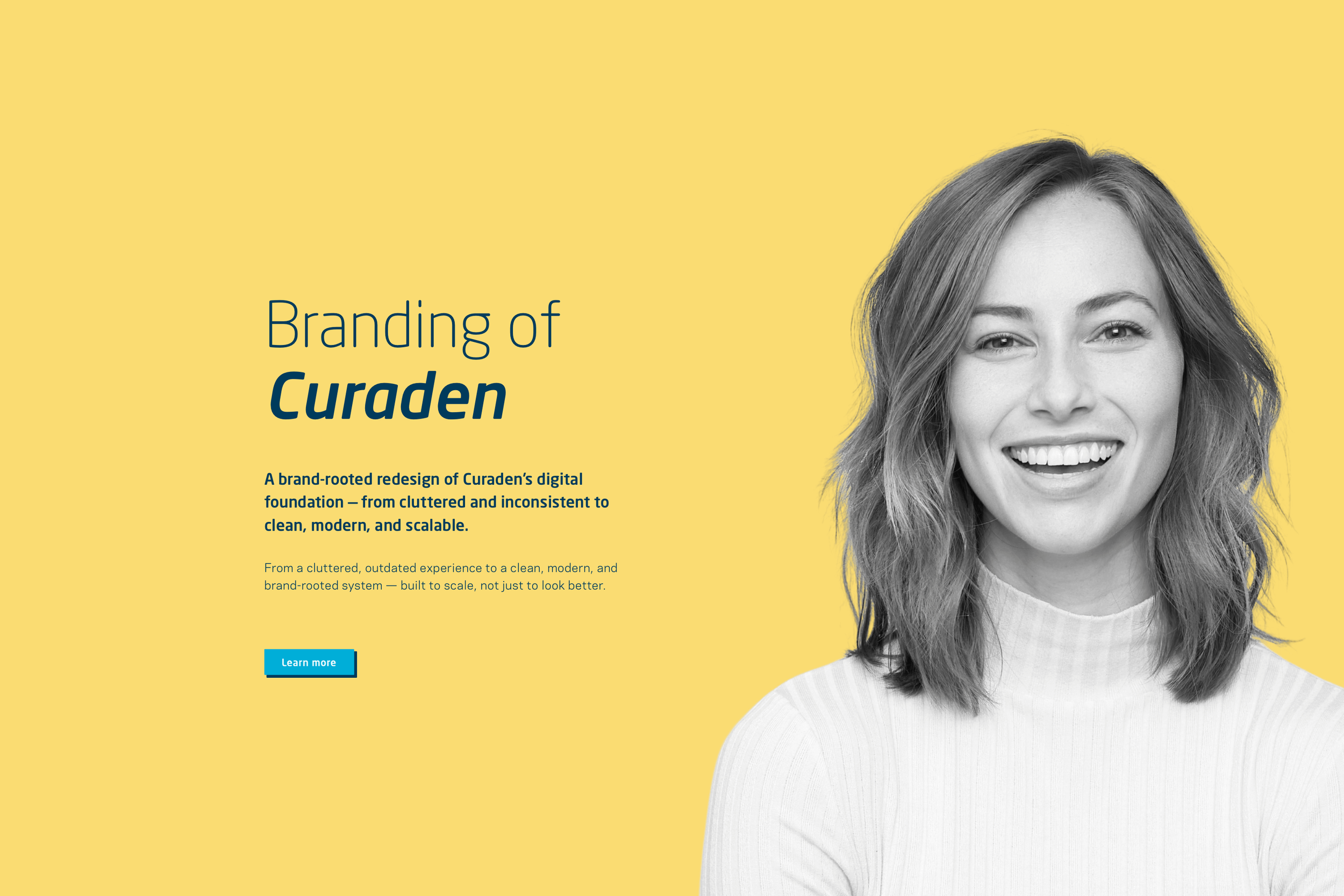
Curaden — Redesigning the core
A brand-rooted redesign of Curaden’s digital foundation — from cluttered and inconsistent to clean, modern, and scalable.
Role: UI Design (with UX Research, PO, Project Lead, Application Management)
Focus: Design system, UI patterns, key journeys, visual refresh without rebranding
Why this project mattered
Curaden is the umbrella and core of our company. Redesigning it wasn’t just another website iteration — it was a milestone in my career and a project that shaped the quality bar of my work.
We didn’t want to reinvent the brand.
We wanted to make it new, make it fresh — while keeping Curaden unmistakably Curaden.
The challenge
The existing experience felt old-fashioned, visually inconsistent, and harder to use than it needed to be. Over time, clutter grew — and with it, complexity.
This project wasn’t about “repainting” the interface.
It was about rebuilding the core experience: clearer structure, stronger consistency, and a system that can evolve.
Design principles
Simplify without oversimplifying
Clean & modern, but still warm and human
Functional first (clarity, hierarchy, readability)
Brand at the core (refresh, not reinvention)
Scalable by system (design decisions that hold up over time)
How we worked
We started from the very beginning:
Research & discovery to understand friction, expectations, and what mattered most
Stakeholder alignment to define goals and success criteria early
Workshops & deep dives to map structure, priorities, and content logic
UI exploration grounded in system-thinking (not isolated screens)
Iterative validation through ongoing user research and feedback loops
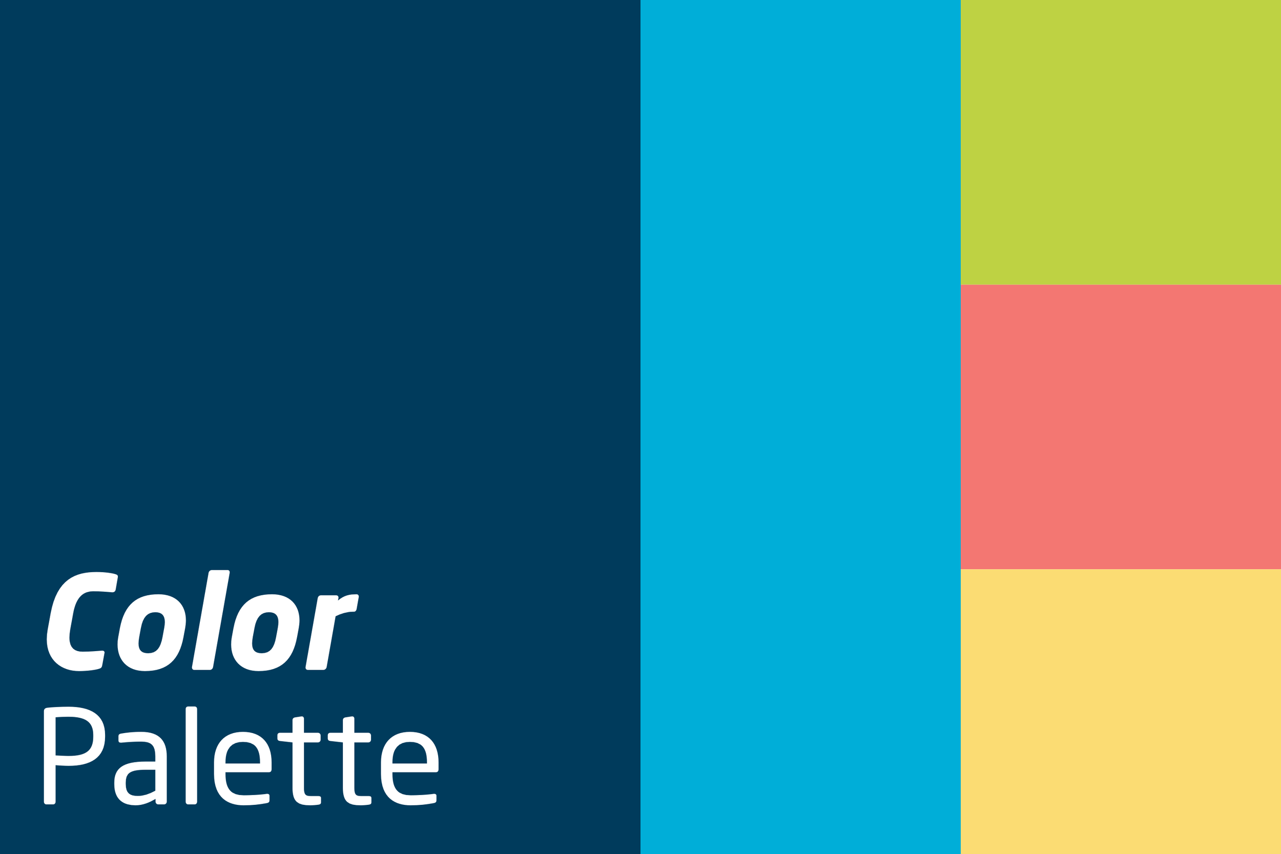
What I built (beyond screens)
A big part of the redesign was creating a stronger foundation:
a refreshed design system (core elements, patterns, rules)
clearer hierarchy & layout logic
reusable components to reduce inconsistency
design decisions that support speed today and scalability tomorrow
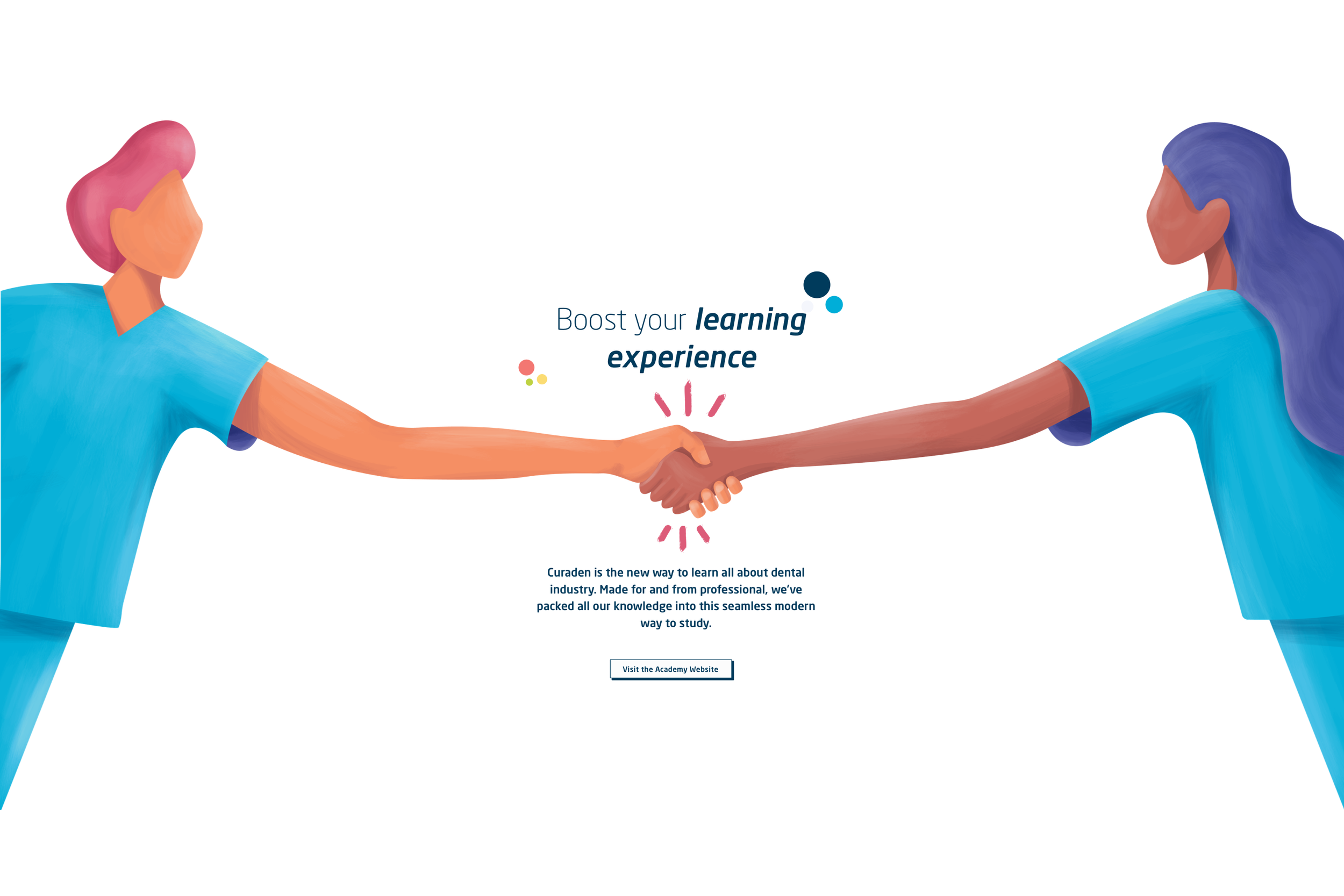
The result
A modern, clean, and more focused Curaden experience — easier to navigate, easier to understand, and more consistent across touchpoints.
And it’s still evolving (as it should). The redesign proved the direction, created alignment, and established a foundation we can keep building on.
What’s next
More steps will follow — refining journeys, expanding patterns, and continuing to improve through research and iteration.
Work in progress — and I’m proud of what we’ve shaped so far.